Jotun Lady 2021 set design & styling
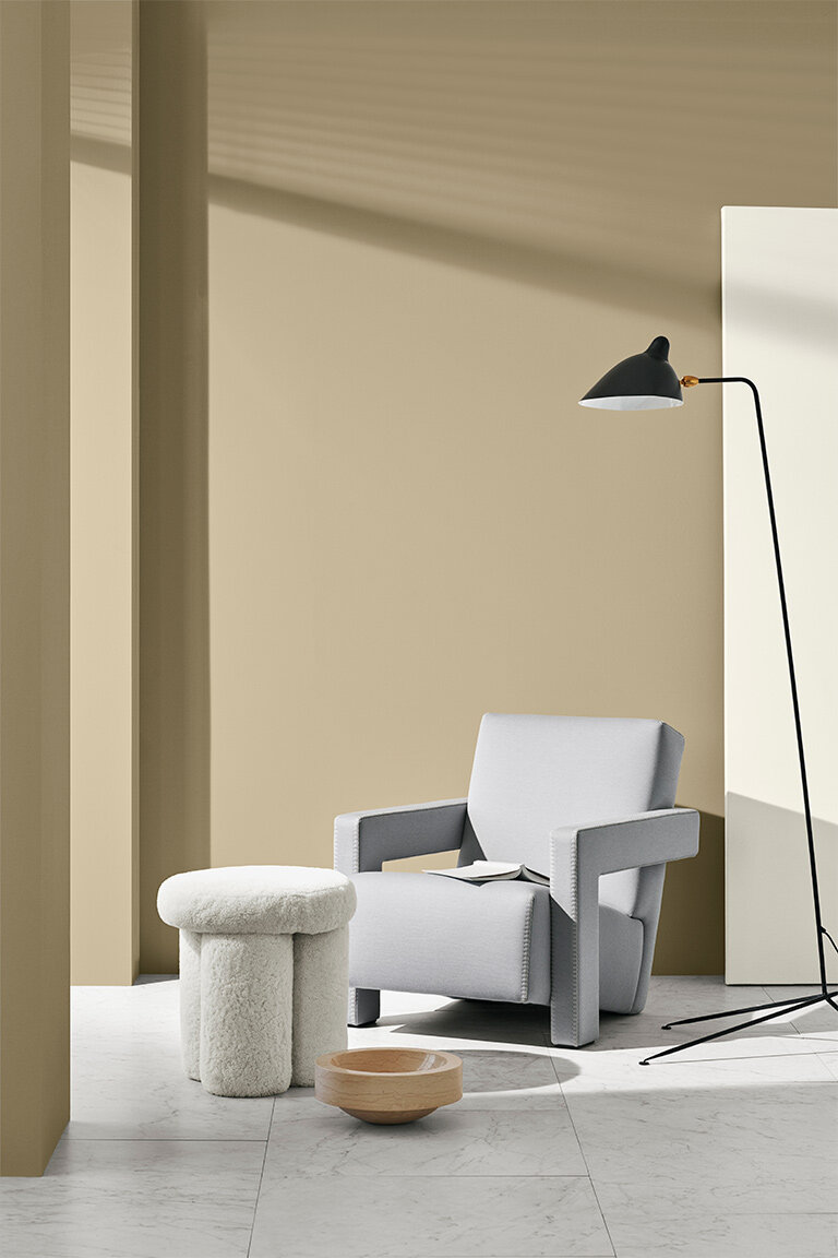
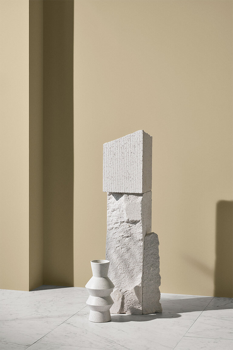
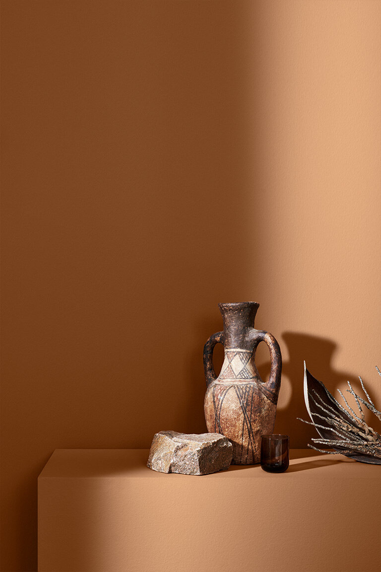
The 2021 color chart from the Norwegian paint company Jotun Lady has just been launched and as usual, it is not only a source of inspiration for wall paint colors but also for interior styling and design.
In charge of the styling and art direction of the new color stories was the Oslo based creative studio, Kråvik & d’Orazio, while the photographs were taken by danish photographer Line Klein.
As a young interior stylist, I admire the work of established studios and in this case, I have long appreciated the work of the Norwegian studio. I am in awe of the carefully assembled compositions, the attention given to the smallest details, the juxtaposition of textures and of course the perfectly balanced color schemes.
I have selected a few of my favorite images from this year’s Jotun color chart that I want to share with you. I am having a beige moment for a few months now and I am moved by soft neutrals and discreet shades of beige. I love the warmth of these shades and their timeless quality, and as a minimalist I appreciate the subdued beauty of a monochrome color palette.
For more inspiring styling and photography visit these wonderful creatives websites linked above.